Brand system · v3

MentionX brand guidelines

Pitch black, silver and red. One diamond, sharp and shiny gradients, one continuous surface. This is the system for the website, product, videos, blog images and social images.

01 · Mark

Logo and wordmark

Mention
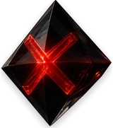
Light backgrounds: the black solid diamond.

Mention
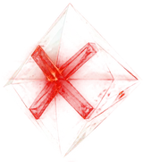
Dark backgrounds: the transparent glass diamond.

  • The logo is always Mention + diamond. Never type “MentionX” as the logo and never put a plain red X beside it. The diamond is the X.
  • The glass diamond is for dark backgrounds only. Never on pearl, white or photo backgrounds. There is no white or crystal diamond.
  • Diamond width = 1.1 × the “Mention” font size, everywhere. Never resize either part alone.
  • Wordmark: Sora 600, letter-spacing −0.05em. Silver gradient on dark, black-to-slate chrome on light.
  • Never redraw the diamond. Use the files and pick the size by display width (64, 160, 400, 800), never upscale.
  • Where the diamond sits inside a CTA, it has no circle or background: just the bare diamond.

02 · Colour

Three families: black, silver, red

Every gradient is sharp and shiny: a bright specular top band, a crisp mid-tone and a deeper base. No flat fills for brand elements.

Pitch black

#000000#0A0A0C#131315

Dark ground. Long, slow silver-grey bands, never navy or violet.

Silver

#FFFFFF#DDE3EB#AEB8C8#8C96A6

Headlines, rims, CTAs, icons. Sharp and shiny: bright top, crisp mid, deeper base.

Red

#FF8A78#FF3B33#B0080F

Action and emphasis: the X, the gap, the one number that matters. Never a background.

Pearl (light ground)

#FBFBFC#F3F3F5#E7E8EB#DEDFE3

Light ground with a light-silver finish. Never pure white.

  • Red is the action colour. The X, the gap, a key number, a warning. It carries a gradient (#FF8A78 → #FF3B33 → #B0080F), never flat coral and never a background.
  • Retired: gold, champagne, copper, coral, sky blue, navy, violet and teal accents. They do not appear on the site or in new creative.
  • Exceptions: AI engine logos keep their own brand colours; green (#34D399 / #0E9F6E) means status only (completed, monitoring, saved); the dashboard mockup keeps its legacy accents until the app is restyled.

03 · Surfaces

Black and pearl, one continuous page

  • Dark: pure black with long, slow silver-grey bands (about 1800px each, slightly angled). Moon at the real current phase in the top-right corner, faint silver stars and rare silver shooting stars.
  • Light: pearl with a light-silver finish, never pure white. No moon, stars or blue wash. Shine comes from chrome headlines and the silver shaft in the hero.
  • The page is one continuous surface. Sections never sit in boxes or change colour abruptly; colour changes are slow and natural.
  • Cards and the nav are glass: frosted, with a hairline silver rim.

04 · Buttons

Primary CTA

Check my AI visibility

Light: metallic black, silver gradient rim and sheen, shiny silver label, transparent glass diamond.

Check my AI visibility

Dark: chrome silver, shiny black label, bare solid black diamond.

  • The CTA is the inverse of its surface: black on pearl, silver on black. Red is not used for buttons.
  • The diamond is the inverse of the button: glass on the black button, solid on the silver button.
  • One primary CTA per view. Secondary buttons are plain glass with a silver hairline.

05 · Navigation

Nav, menus and icons

  • Dark nav: pitch-black glass with a silver rim. Light nav: pearl glass with a graphite-silver rim. No blue or red aurora.
  • Section icons sit on polished metal tiles (graphite tile with silver glyph on dark, silver tile with graphite glyph on light).
  • The shine is a sharp highlight that travels inside the icon strokes. The tile itself never sweeps or glows.
  • Menu threads and rails are silver gradients, never blue or red.

06 · Typography

Sora and Inter

Sora: display headings

Hero, section titles, wordmark (600, −0.05em)

Inter: body and UI

Paragraphs, nav, buttons, forms, captions

  • Headlines are chrome: silver chrome on dark (bright crown, silver body, one darker band), polished black chrome on light (black body with one bright reflective band).
  • One word or number per headline may take the red gradient (for example “gap” or “14%”).
  • Body copy is a muted silver-grey on dark and slate on light. Never long paragraphs in pure white.

07 · Content

Videos, blog images and social images

Same system, so a thumbnail, a LinkedIn card and the homepage look like one brand.

  • Background: pitch black with a soft silver glow and a faint starfield with grain. Pearl is allowed for light variants.
  • Headline: Sora, silver chrome on black. One red-gradient word or number as the focal point.
  • Logo: Mention + glass diamond on black, bottom left or centred, at a consistent size. Never stretched, recoloured or placed on busy imagery.
  • Imagery: editorial space metaphors (planets, signal, orbit, light through glass). No robots, brains, circuit boards or stock tech.
  • Data in visuals: real numbers from the product only, labelled with the source and date. Engine logos keep their own colours.
  • Video: black frames, slow silver light sweeps, red used once per scene for the thing that matters, the diamond as the closing frame.
  • Never: blue or purple gradients, gold, neon, drop-shadowed white text, a flat red background, or the logo as plain text.

08 · For tools and agents

Paste into any brief or project instructions

Copy this into design tools, video briefs, AI image prompts, AGENTS.md or Cursor rules so every asset follows the same system.

MentionX brand v3. Palette: pitch black, silver and red only. Dark ground = pure black with long slow silver-grey bands (never navy, violet or blue). Light ground = pearl with a light-silver finish (#F3F3F5 to #FBFBFC, never pure white). Gradients are always sharp and shiny: bright specular top, crisp mid-tone, deeper base. Silver = #FFFFFF #DDE3EB #AEB8C8 #8C96A6. Red = #FF8A78 #FF3B33 #B0080F, used only for the action or the one thing that matters (the X, the gap, a key number), never as a background. No gold, champagne, copper, coral, sky blue, navy or violet. Logo = Mention + diamond; black solid diamond on light, transparent glass diamond on dark only; diamond width = 1.1 x the wordmark font size; wordmark Sora 600, letter-spacing -0.05em; never redraw the diamond, use the files. Fonts: Sora display, Inter body. Headlines: silver chrome on dark, polished black chrome on light. CTAs: dark = chrome silver with a shiny black label and a solid black diamond; light = metallic black with a silver gradient rim and a transparent glass diamond. Imagery: editorial space metaphors on starfield and grain; no robots, brains, circuit boards or stock tech. Exceptions: AI engine logos keep their own colours; green is for status only.

Implementation

Source of truth in code

Homepage theme overrides live in apps/marketing/src/styles/homepage-theme.css; brand tokens in apps/marketing/src/lib/mentionx-brand-system.ts. Update this page whenever either changes.